Project 1: Self Portrait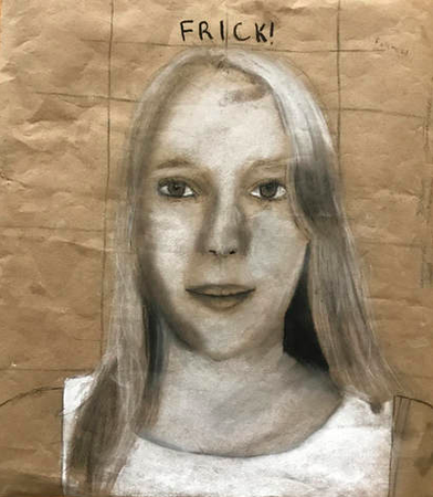
1. In drawing this self portrait, one of the main techniques I worked hard to incorporate was value. Using charcoal, I had to use the heat of my fingers to add shading to my piece which in turn added value that makes my portrait look much more realistic. One of the techniques I struggled with while making this portrait was in using form correctly. I believe that I did not adequately transfer my facial features from my image to my drawing using the correct form which led to portrait not looking very much like me.
2. I used ideas from other artists in my class as well as from a portrait I found drawn by Ben Slow. This influenced my art because it used value and white areas very well which is something I needed help with. I also saw how they used the shading in his portrait to create a gradient. 3. My piece started off as a grid with dots and lines connecting where my facial features were going to be when I progressed. I then moved on to create the simple shapes of each facial feature, starting with the eyes and moving onto the mouth and then the nose. I used composition to decide where to place each facial feature and used value to add shadows and create more depth and definition of characteristics on my face. 4. If I had more time and could redo my portrait, I would change the shape of my eyes and make the spacing between my nose and mouth closer. The shape of my eyes was wrong and the spacing was too far apart which messed up all of the proportions of my entire portrait. 5. This is similar to my other works because I used charcoal to create this work.
|
Project 3: Red Rocks Oil Painting
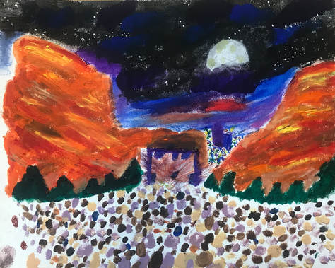
1. This piece I used oil paint for the first time. This new medium allowed me to explore techniques I had not used before. I added much more vivid colors with the use of the paint and had to use a small brush stroke technique to add layer the colors and blend some of the reds and yellows I used to represent the red rocks and the colors of the sky. I struggled with adding color into all the white space and blending together all the elements into a piece that was compositionally pleasing.
2. I took inspiration from a photo of red rocks taken by an anonymous artist. The photo really captured the atmosphere of red rocks and I was inspired to create a painting that also showed this.
3. I began with a rough outline of shapes and where I would place each element. Then, I began by adding the base colors and added detail to each part. Finally, I added detail by layering colors and using smaller strokes for the people, city lights, and to add texture.
4. If I were to redo this piece, I would have left less white space and created more of a flow between each element of the piece. I think that the white space made the painting look unrealistic and the lack of flow between each shape made it look very messy.
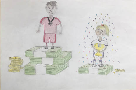
5. In all of my pieces, I am trying to do pieces inspired music. In my first piece, an issue in soccer/sports was what I was showing. Music has always been one of the things that has kept me motivated in soccer. In this piece, red rocks is my favorite music venue and I wanted to keep intertwining the effect music has in my life on my pieces.
2. I took inspiration from a photo of red rocks taken by an anonymous artist. The photo really captured the atmosphere of red rocks and I was inspired to create a painting that also showed this.
3. I began with a rough outline of shapes and where I would place each element. Then, I began by adding the base colors and added detail to each part. Finally, I added detail by layering colors and using smaller strokes for the people, city lights, and to add texture.
4. If I were to redo this piece, I would have left less white space and created more of a flow between each element of the piece. I think that the white space made the painting look unrealistic and the lack of flow between each shape made it look very messy.
5. In all of my pieces, I am trying to do pieces inspired music. In my first piece, an issue in soccer/sports was what I was showing. Music has always been one of the things that has kept me motivated in soccer. In this piece, red rocks is my favorite music venue and I wanted to keep intertwining the effect music has in my life on my pieces.
Project 4: Pointillism Oil Painting on Canvas
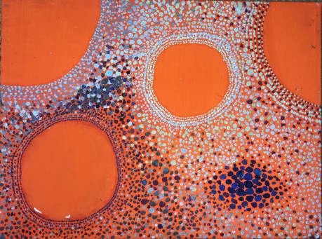
1. In this piece, I tried a new technique, pointillism. I struggled a lot with this throughout the process of creating my piece. This was mainly because I used oil paint which does not dry quickly and thus led many of my dots to smudge. I also tried to create value by blending and shifting the many colors with little points. I think I masted this technique on some portions of the painting but also struggled with it in general.
2. I took inspiration from Vance Kirkland in this piece. Prior to creating this, I visited the Kirkland museum. While there, I learned a lot about Vance Kirkland and all about how he created his art. He had a rare ability called synesthesia, which allows him to see colors that he hears when listening to music. He could essentially "hear color". While I do not have synesthesia, I was inspired to create a piece like this and also tried to pick out the colors and emotion I heard in a song I was listening to and based my entire piece off of that. He also used pointillism and created abstract pieces based off of music so I wanted to try that technique as well.
3. I began by painting my entire canvas orange. I then listened to the song I based this piece off of to try and gather what colors I felt were most fitting. After selecting my colors, I created the outline of a few large circles which I decided to leave with no dots in order to contrast the other colors and have pops of orange. From there, I began by dotting around each large circle and worked my way out, creating based on what I heard in the music and adding new colors when I felt a change in the music.
4. If I were to redo this piece, I would've more fluidly blended together the colors in order to have the piece be more visually pleasing. I also would've protected it more, because in the transportation process, a large amount of dots got smudged and I had to work to fix it, even though it never ended up looking as clean as it did originally. I also would not have used acrylic paint for the base because it cracked off and was not a great base for the oil painting.
5. This connects to my previous pieces because of the link of music. To my last piece, my red rocks painting, it also connects because I used the same medium, oil paint to create the piece.
Project 5: One Line Drawing
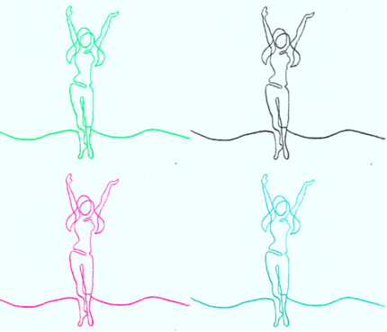
1. To create this piece, I experimented with created many different sketches, all with one line trying to create a look of a person or people dancing. While at first I struggled with creating fluid lines that actually looked like a shape, I believe this also ended up being the technique I mastered.
2. The main artist I took inspiration from was Andy Warhol. While my initial line drawings were inspired by a friend that I interact with on a daily basis, the idea to create the different colored, repetitive images, came from Andy Warhol. I would have liked to make the image duplicated many more times to have an even more similar composition to many of Warhol's pieces.
3. I began by sampling many different drawings, all that were made of one continuous line. From there, I made three smaller versions of the drawings that I felt most accurately portrayed movement in the drawing. I was planning on creating something with all three of these sketches, however settled on the person dancing with their hands in the air because it showed the most movement and joy even just through a line in my eyes. From there, I scanned my image that I had drawn in pencil onto my computer where I used photoshop to reach this final composition by adding color to each of the lines and duplicating the image four times.
4. If I were to redo this piece, I would've duplicated the image more times in order to create a more epic effect and have more color involved. I feel this would've more effectively portrayed the effect music can have on a person. I also would've like to involve movement of some sort if I were to abandon the photoshop idea. I would have either liked to do so through a spinning cylinder that created an effect of the person actually dancing or through a computer graphic which showed the lines waving and flowing.
5. This connects to my previous pieces because I was inspired by music while making it. To me, the person portrayed by these lines has music flowing through their body causing them to dance and feel happiness and light, something which I tried to portray through the bright colors yet also show some simplicity by contrasting them with the black line drawing.
Project 6: Lollipop Watercolor Painting
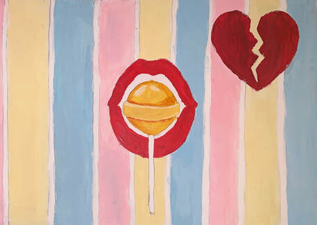
1. In this piece, I used many techniques. One that I mastered was adding value. I believe I specifically mastered this on the lollipop by adding different colors to create shadows and make it look more realistic. I could've added more value to the lips but instead went for a simpler look which made them look less realistic. I struggled in that my pencil from my initial sketch showed through onto the final version because I assumed it would be covered by the paint and it was not due to the fact that it was watercolor paint.
2. The artist I drew initial inspiration from on this painting was music artist, Mika. This is because this piece was inspired by his song, "Lollipop". The painting itself was inspired by a modern art piece I saw online which used the pink, yellow, and blue color scheme which I decided to use due to the way the colors complemented each other and gave off a happy, childish vibe.
3. I first began by sketching out my piece in pencil. Following this, I made the decision to use watercolor instead of acrylic paint. I used watercolor paint in a more concentrated form in order to still create bold colors but also give an opportunity for blending. Once I had decided to use watercolor, I picked my colors out and decided to go for bold colors for the main portions of my piece, the lips, lollipop, and broken heart. I added an initial layer of paint and followed this by adding value. I then added in white lines to try to create a cleaner look and go over some of the remaining pencil lines.
4. If I were to do this over again, I would add more value to the lips and the heart and I would make sure to erase all of my sketched pencil lines before painting.
5. This piece is connected to my prior pieces again through the link of music. Guided by one of the topic ideas on the website, childhood, I took inspiration from a song that I grew up listening to and have many memories surrounding. The bright colors I used here are also similar to some of those in my previous paintings.
Project 7: Photo Series
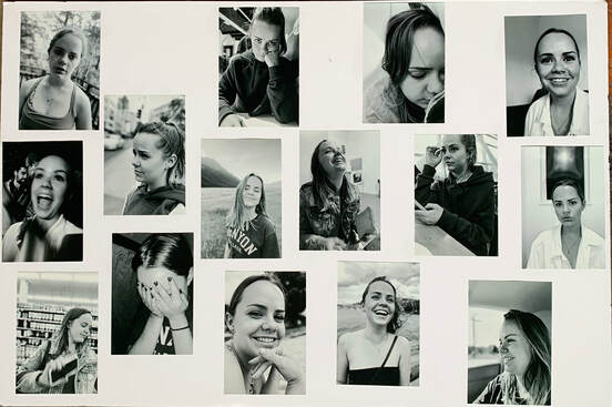
1. In this piece, I tried photography for the first time. I struggled to get images that were clear when I took candid shots but eventually ended up mastering that. I wish that I has discovered photography earlier because I really enjoyed taking these images.
2. The artist I drew inspiration from was Dasia Hughes. I saw her photos and wanted to capture people in my life in a raw way like she did in her images.
3. I first began by taking a series of about 100 pictures of my sister. They were in color, so I edited them to black and white to show the emotion and not have the colors be distracting. I then chose about 20 pictures from the wide array I began with and got them printed. I chose to present them on a white board because I believe it helped create contrast and bring attention to each photo. I narrowed down these photos as my final set because it was a group of photos that showed a wide variety of emotions and were taken during very different times.
4. If I were to do this over again, I would have created an even larger piece and included all of the photos I took.
5. This piece is connected to my prior pieces because it is another example of human connection.Some of these photos were candid while some she was aware I was taking. Again, my sister is one of the strongest human connections in my life and I wanted to capture the complexities and variety of her as a person.
Project 8: Across the World
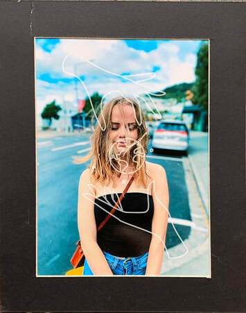
1. After exploring photography in my last piece, I decided to use photography again and also use graphic design. I mastered capturing pictures with the focus on my sister in this piece. I also learned how to create a design and put it on my piece.
2. The artist I drew inspiration from was Annie Leibovitz. Her portrait photography was very impressive to me due to her use of bold, vibrant colors which is something I wanted to attempt.
3. I first began by taking the picture of my sister. I wanted to capture the wind blowing her hair to capture an element of movement. After taking the photo, i created a design to play atop to try and show my message of connections across the world. Finally, I got my piece printed onto an 8x11 photo and matted it.
4. If I were to do this piece over again, I would have tried to capture a piece with more emotion to show the effects of connection.
5. This piece is connected to my prior pieces because it is another example of human connection. I decided to place a graphic of two hands joining across the world to signify that despite distance, connections between humans can be just as strong. I also decided to show the vibrant colors in the photo to exemplify the brightness and joy of a true, strong, human connection.
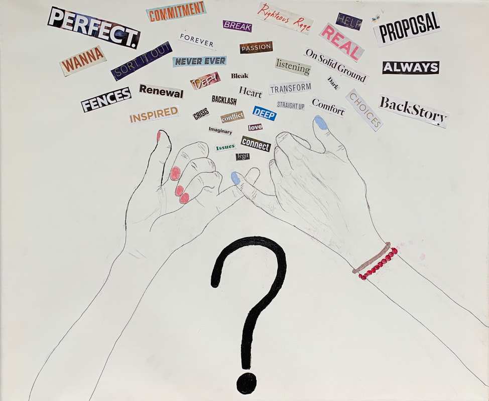
Project 9: Pinky Promise